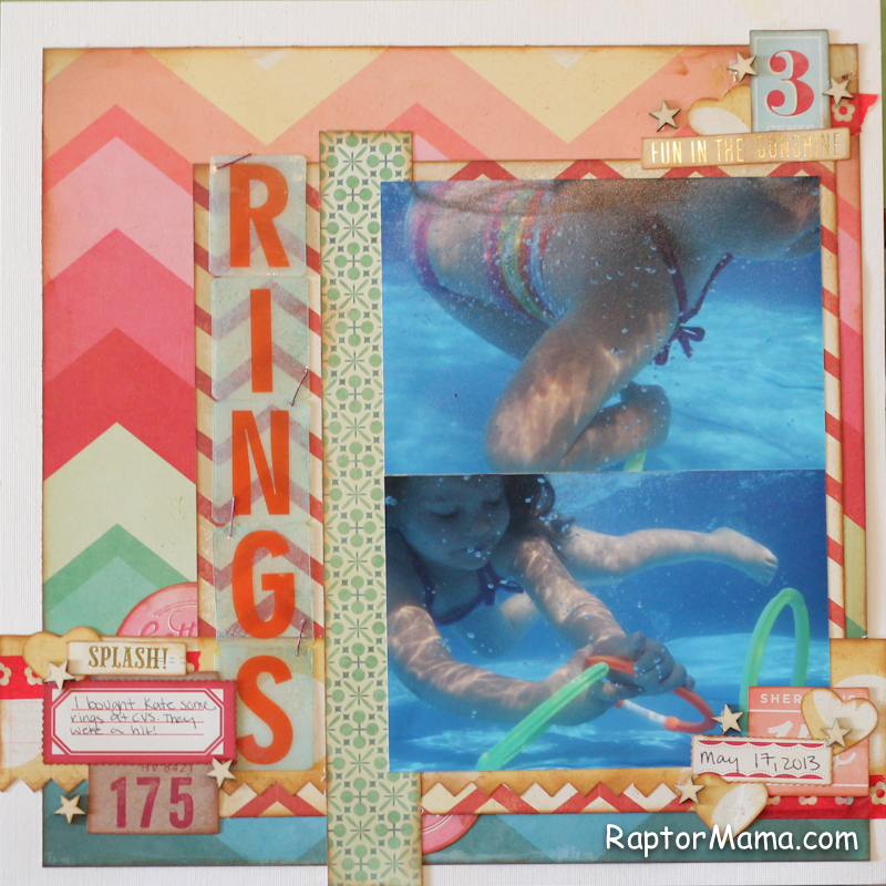
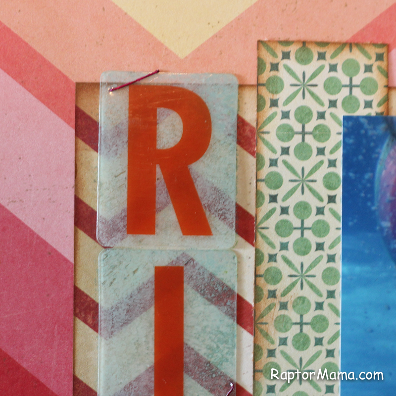
I love these letters from The Pier collection, but I sometimes struggle with how to use them. Unless the background paper is pretty plain they’re very hard to read. I decided to do a little experimenting. First I tried painting the back of the letters. In theory, I think this would look great. Unfortunately, my green paint was dried up and I’m not known for my patience. Next I tried some spray ink, but it was taking forever to dry. The next morning it looked great so I think you’ll see it on a page in the future, just not this one. lol. In the end I used a regular ink pad and it gave it just enough color to be readable while still letting the background paper show a bit. Just make sure that you put the ink on the backside of the tile.
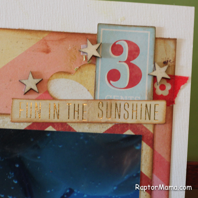
 I used several pieces from the ephemera pack in the embellishment clusters along with some washi tape, wood veneers, and some hearts I punched out with the Martha Stewart punch.
Here’s the whole page. Side note: why yes, I am addicted to my underwater camera. 🙂